Officeworks home screen
A personalised, goal-oriented home screen for an audience that arrives knowing exactly what they came to buy.
Officeworks is one of Australia's leading office-supplies and stationery retailers. As part of their product roadmap, they wanted to introduce a personalised home screen to better serve their customers.
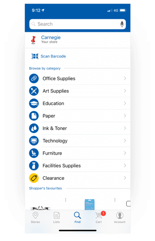
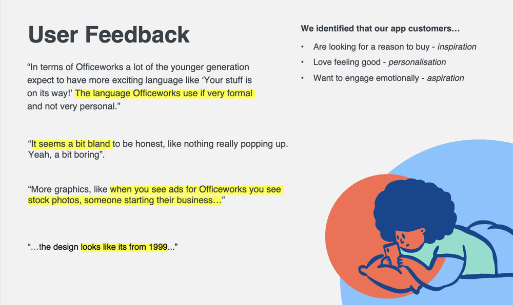
The existing app hadn't been updated in a while and lagged behind other major retail apps in both functionality and experience. Analytics told a clear story: users were highly goal-oriented. They arrived knowing exactly what they needed and were ready to buy. That insight shaped everything that followed.
Discovery
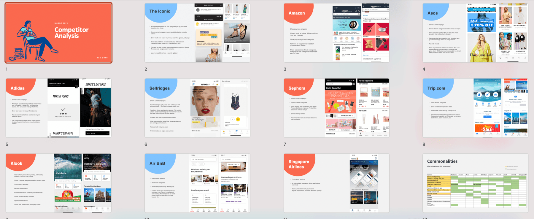
I explored popular retail and travel apps, pulling out how they handled personalised and seasonal content. Sharing those patterns with stakeholders helped secure buy-in for the work.
I ran baseline usability testing with 5 users through Askable; there were no prior studies to build on. The landing screen made people navigate 5–6 subcategory levels just to find a product, with no curated sections to browse and no intuitive starting point.
Armed with gift cards as incentives, I also visited a store to gather feedback on the landing screen in person. It was genuinely insightful to talk to such a range of customers where they actually shop.
Ideation workshop
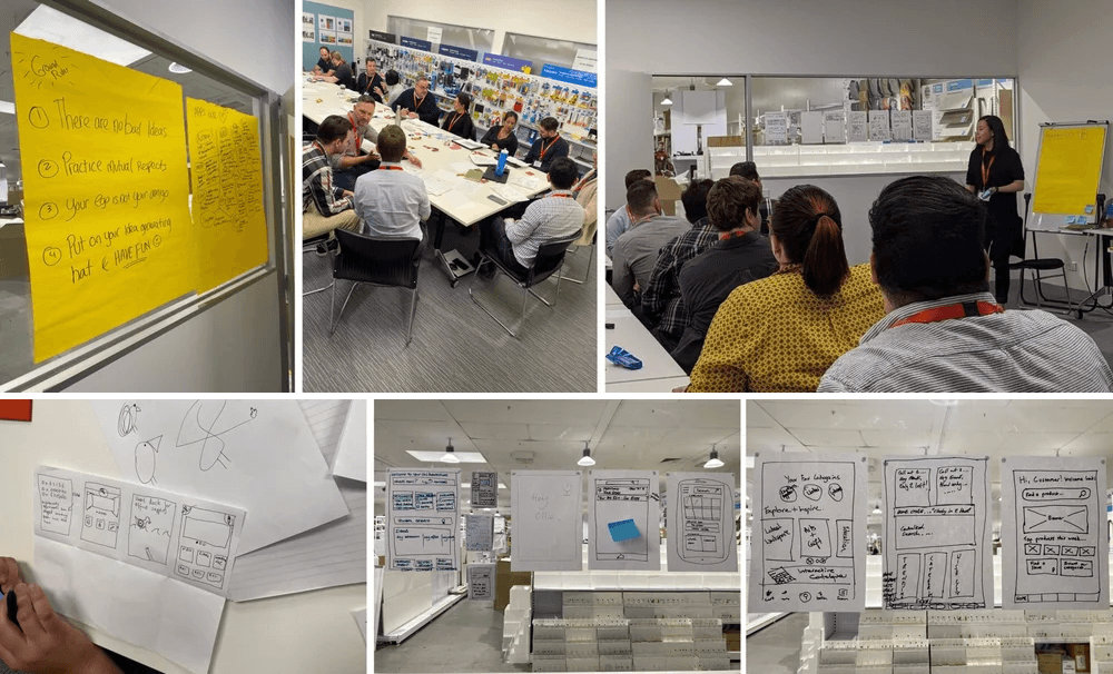
I organised and facilitated a home-screen ideation workshop with 22 participants. I lined up stakeholders, arranged lightning talks and made sure the speakers were prepped.
We opened with a warm-up and a Crazy 8s exercise, then paired people up to develop one design they believed in, and shared them back as a group. Over 2.5 hours the room generated a huge amount of material, which I then synthesised into the vision piece.
Design
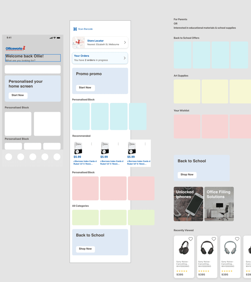
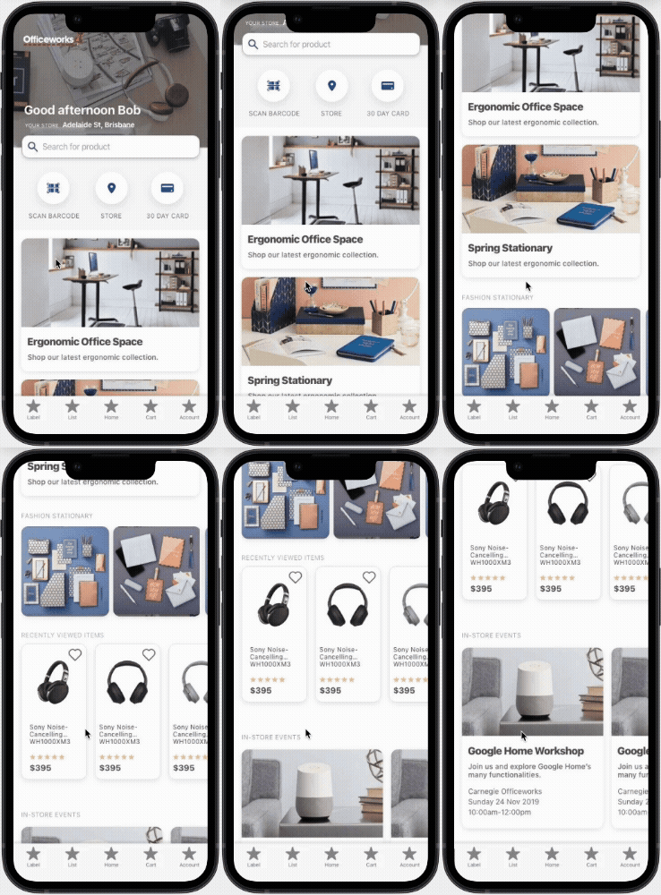
The research and the workshop ideas informed the direction: a home screen that opens with the things a goal-driven shopper actually wants (quick actions, personalised blocks and seasonal, inspiring content) instead of a category index.
The data and the feedback pulled against each other here. Analytics said people arrive on a mission, with 23% going straight to search. Feedback said the app felt bland and people wanted inspiration. I decided the home screen's first job was speed: quick actions and personalised blocks up top, seasonal and inspiring content below. Inspiration earns its place after the errand is handled, not before.
- Home
- Category
- Subcategory
- More subcategoriesLayovers · ×5–6
- Product
- HomeQuick actions + search
- Product
The old journey made every shopper transit the category tree. The new one boards them straight from the home screen.
Reflection
I built the vision for this home screen and brought the business with me: the research, a 22-person ideation workshop I ran end to end, and a direction stakeholders bought into. My contract wrapped before the final build, but Officeworks went on to ship a home screen that closely follows that vision. It's the version customers use today, and the line back to the work I led is clear.