Equity & home loan tool
Reworking a drop-off-prone loan tracker into a finance experience property owners actually stick with: clear equity, a clear home-loan picture, and a nudge toward a better rate, inside realestate.com.au.
Inside realestate.com.au there's a genuinely good experience for property owners to track their properties. Part of it was a legacy finance product, a loan tracker, that had real potential to give people useful insight into their money, but wasn't yet delivering on it.
The outcome, first
The headline: in the first couple of weeks after the redesign shipped, completion of the flow jumped from 29% to 70%, and lead submissions climbed from 20 to 62 a month. Early numbers, but pointing firmly the right way. The rest of this study is how we got there.
The problem
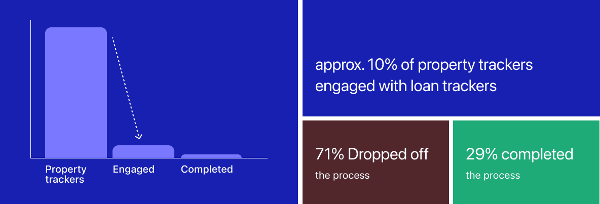
The loan tracker had been around for a few years. It met the objectives it was originally set, but the numbers told a harder story: only around 10% of people tracking their property engaged with it at all, and of those who started the flow, 71% dropped off before finishing.
Something about the experience wasn't earning people's attention or trust. That drop-off became the measure we committed to before design started: more people finishing the flow, and more of them reaching a broker. The numbers at the top are that commitment, answered.
The process
I started with research: nine one-on-one interviews with brokers to understand how people really think about their equity and repayments. From there I planned and facilitated ideation and principles workshops, one with the squad and one with stakeholders, then took the strongest ideas into design.
From there the design ran through four iterations, each one earning its changes from usability testing or stakeholder reviews, with a shareback at the end to bring everyone along before build.
- Broker interviews
Nine one-on-ones on how people actually think about their equity and repayments.
- Principles + ideation
Two workshops, one with the squad and one with stakeholders, to align on principles before pixels.
- Iteration 1 · usability testing
Explored the workshop's strongest ideas and put them in front of users. Testing was blunt, in the best way. The decisions below came out of it.
- Iteration 2 · stakeholder reviews
Reordered the experience around what testing surfaced. Review sessions with the squad, product leadership and other teams, plus a week of open feedback in Figma.
- Iteration 3 · tech reality
Reworked around what the platform and data could actually support.
- Iteration 4 · guerilla testing
Further refinement, then a guerilla round in the REA office. Incentive: homemade cookies. They worked.
- Shareback + build
Consumer feedback shared back, final design locked, into build.
The route from first interview to build.
The decisions in between
The first round of usability testing was blunt with me. Leading with accessible equity confused people. The value exchange felt one-sided: users wanted insights that genuinely helped their next decision before anything was asked of them. Financial jargon needed explaining. And the relationships between the brands involved were not clear.
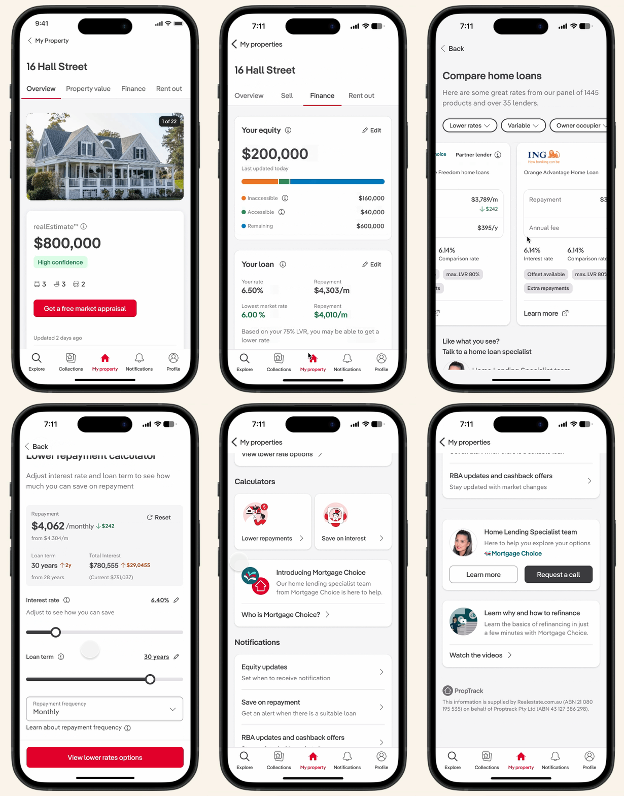
Each of those became a design call. The hierarchy flipped, so your full equity picture comes first and accessible equity is part of the story rather than a confusing headline. Insight now comes before any ask, so the experience gives before it takes. And plain-language tips and tooltips carry people through the jargon instead of assuming they speak property finance.
Not everything bent to design. The tech team couldn't support an interactive graph and the data team couldn't stand behind property-growth projections, so both were cut in favour of a glanceable view that could actually ship. Round two of testing confirmed the equity estimation now felt useful, but the call to action read as too salesy, so the copy softened to match the tone around it. And the finding that took the longest to crack: the brand relationships were still murky in round two. The final design answers it head-on with a brand introduction card, so the relationship is explained inside the experience instead of assumed.
The final design
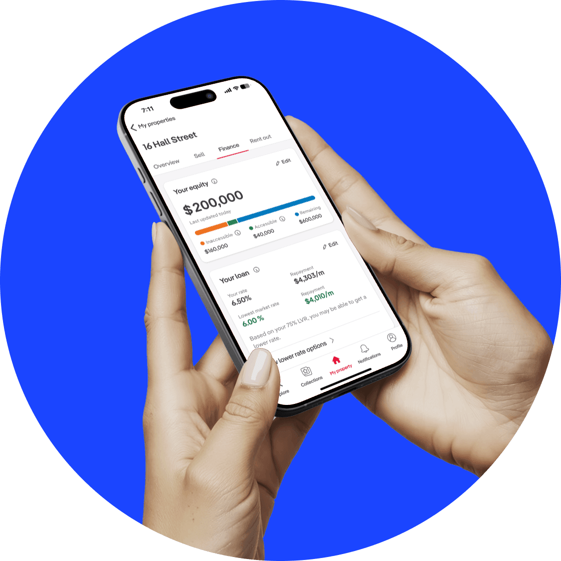
The redesign brings equity and home loan into one clear, glanceable view: how much equity you have and how much of it is actually accessible, your current rate and repayment, and, where it's relevant, a nudge toward a lower rate based on your LVR. The complex stuff stays in the background; what surfaces is what helps people make a decision.
What people said
The qualitative signal matched the numbers up top. People rated the experience 9s and 10s, and told us why:
Simple to use. The visuals really help illustrate the loan amount versus the equity.
It helps me keep track of subtle market changes in interest rates, and the differences between lenders.
Challenges
This one came with no shortage of challenges. There were a lot of stakeholders to keep aligned, and because the experience spans federated teams across realestate.com.au, the design and functionality had to stay coherent across boundaries I didn't fully own.
The product also had to prove its value upfront, which meant simplifying genuinely complex finance concepts into something glanceable. And with no existing guidelines for data visualisation to lean on, much of that had to be worked out from scratch.
What I learned
A few things I'm taking forward. Estimate timelines with a buffer; finance work has more moving parts than it first looks. Over-communicate: a dedicated Slack channel for updates did more than I expected to keep everyone oriented. And collaborate early and continuously, so the people around the work are brought along on the journey rather than handed the destination.