Website & franchise CMS
Reworking the broker minisites on the Mortgage Choice domain, and the CMS behind them, into a clearer site template and an editor brokers can actually use, all within real tech constraints.
Every franchise in Mortgage Choice's broker network is assigned a website, a "minisite", under the Mortgage Choice domain. They'd been around for a while, with limited styling options and limited functionality, sitting on a publishing process that hadn't aged well.
The brief was deliberately grounded: improve the minisite experience for brokers and for consumers, within the current tech limitations. Not a rebuild: a meaningful uplift to the template brokers present and the CMS they run it from. I led the design end to end across discovery and design, releasing in phases through September and October 2025.
The outcome, first
The uplift landed across the whole franchise network: every minisite moved onto the new template. More telling than the rollout, though, is what brokers chose to switch on: the capabilities they had to opt into, not the ones that came for free. That was the measure we set before design started: rollout was guaranteed, adoption was not. The rest of this study is how it happened.
The minisites
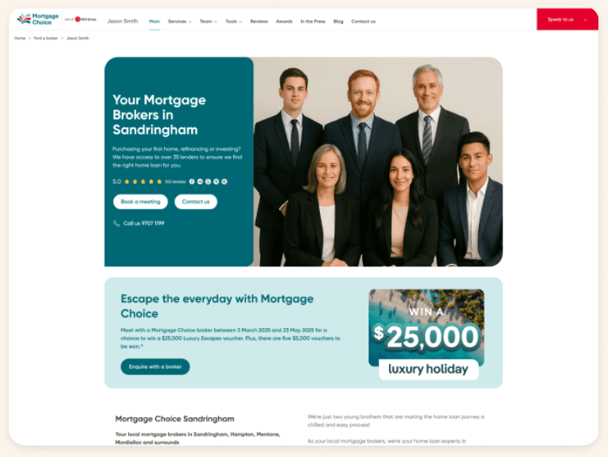
The old template worked against everyone. Contact details and the map sat so low on the page they were routinely mistaken for the footer. The hero used an awkward image ratio, and updating it ran through a legacy process that could take 24 hours to go live. Content styling was minimal, a single body area split into two columns, which left brokers boxed in and gave consumers an overwhelming wall of copy. And brokers had no way to do the one thing they most wanted: showcase themselves and their team.
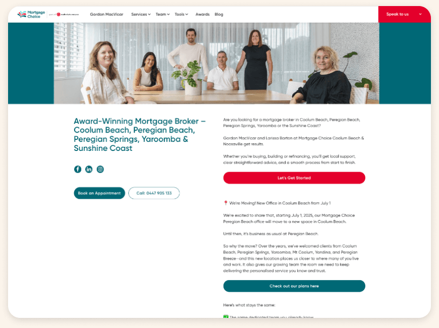
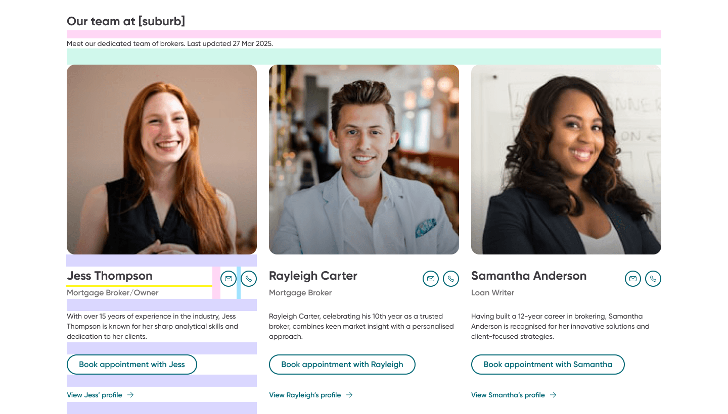
The redesign opens with a proper hero at a cleaner 2:1 ratio, then hands brokers a kit of content blocks to personalise their landing page. Brokers had asked for their automated marketing campaigns to surface here too, so a promotion runs without anyone scheduling it manually. And because consumers told us they're looking for someone relatable and approachable, suited to their situation, the new template finally makes room for brokers to introduce themselves and their team.
The decisions in between
The constraint under everything: the business runs on Umbraco, with a legacy CMS built on top of it, and neither was changing. So instead of the open canvas brokers couldn't be supported on, I designed a kit of content blocks. Enough freedom that the page feels like theirs, enough structure that a consumer never lands on a broken one. The 41% who opted into the new blocks accepted that trade.
The 24-hour hero process went the same way. Updating a hero image used to mean sending the file to someone in marketing and waiting a day for it to appear; now brokers upload it themselves and see it live. Small on paper, but it turned the minisite from something brokers request changes to into something they run. 58% updated their hero after launch.
- Broker exports the image
- Emails marketingLayover
- Publishing queueUp to 24 hrs
- Live on the minisite
- Broker uploads in the CMSSelf-serve
- Live on the minisite
Updating a hero banner, before and after the uplift.
And before any design started, I ran a website principles workshop with the wider stakeholder group. Many teams own parts of the Mortgage Choice website, and the principles gave us a shared line to hold: for this project, and the ones after it.
The CMS
Behind every minisite is the CMS brokers actually live in, and it needed the same care as the public-facing page. I worked through it surface by surface.
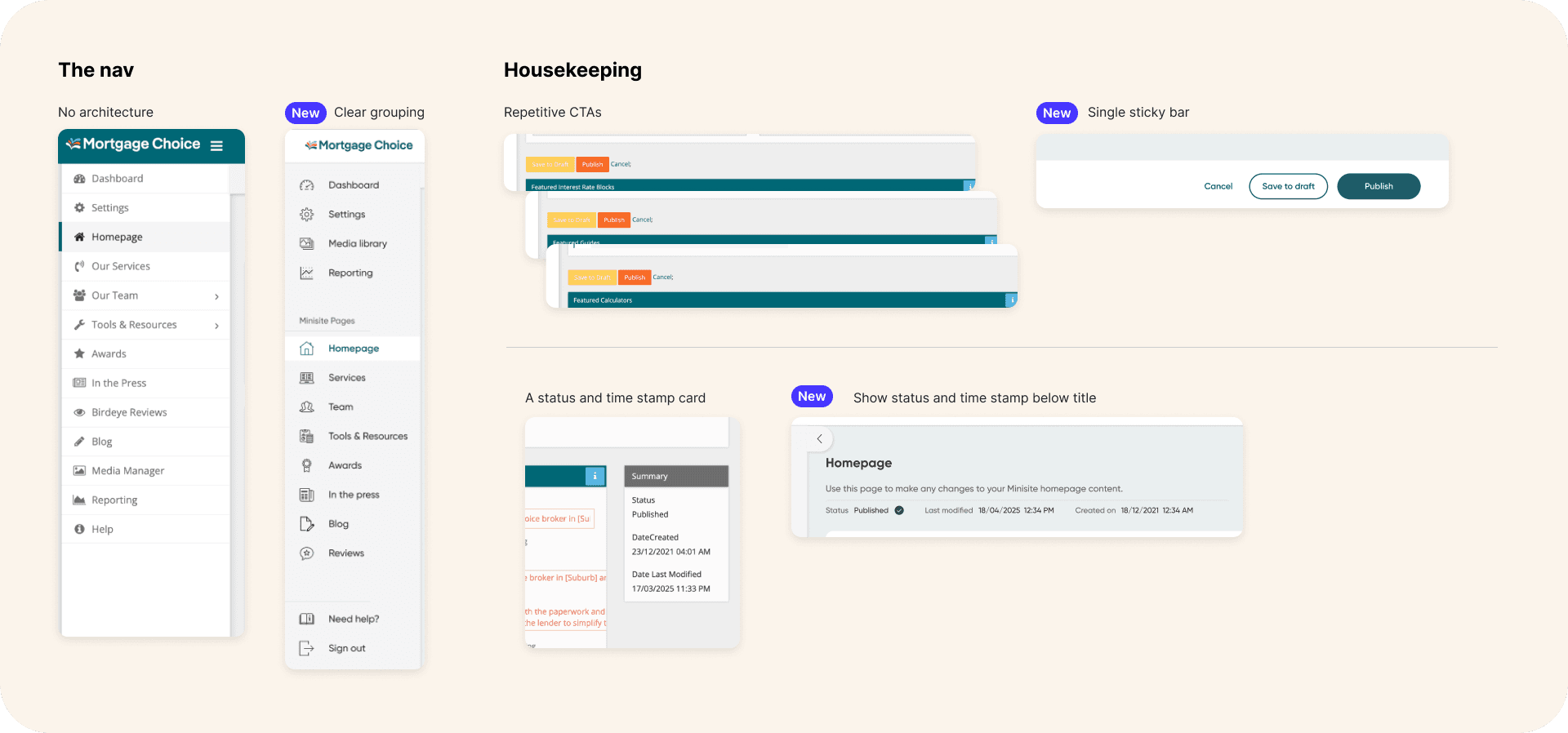
The navigation had no real architecture, so I grouped it into something clear and scannable. The page editor was full of repetitive CTAs; I collapsed those into a single sticky action bar, and moved each page's status and timestamp to sit directly under its title instead of floating in a separate card. And the dashboard, confusing and slow to reflect changes, was reworked to lead with high-level status and the obvious next step.
Keeping it consistent
To keep the template and the CMS coherent as they grew, I worked to a mostly 8px spacing grid, dropping to 4px for the smaller steps. Building each new component on that shared rhythm means a broker's page stays tidy no matter what they put into it. For a template hundreds of franchises edit themselves, that is the whole point.
Reflection
Almost all of this was designed inside the constraints of an existing CMS: what the platform could and couldn't do shaped every call I made. I'm proud of how much the experience improved without the luxury of rebuilding the system underneath it; the wins came from designing with the limitations in full view, not pretending they weren't there.